Brand identity, brand guidelines, social system, Ramadan launch campaign, and landing page for a Pakistani pizza delivery app. One designer, full scope, one consistent brand world.
Bayked was launching into Pakistan's pizza delivery market against incumbents with bigger budgets and established users. The brand needed to land with a complete identity, a clear voice, and content that stuck in memory the first time someone saw it.
Beyond visuals, Bayked had a real positioning angle: built as the restaurant's brand extension, not another marketplace squeezing them on commissions. The launch had to communicate that story without sounding like a manifesto.
Five connected workstreams across brand, design, and strategy. Treated as one system, not five separate deliverables. The launch only worked because every surface said the same thing.
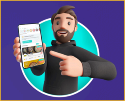
Built the full brand identity from scratch: logo, primary palette (verdigris teal + Spanish violet), supporting accents, and a 3D mascot with a hip-hop, laid-back personality that anyone who enjoys food could relate to.
The mascot wasn't decoration. It was a strategic call: gave Bayked a face customers could remember in a category full of faceless apps.
Wrote and designed the full brand guideline doc: logo construction, exclusion zones, alternate backgrounds, mono-color usage, primary and secondary palette with usage percentages, primary and secondary typefaces, photo treatment, illustration style, iconography, and social post templates.
The team could ship Bayked content for years without breaking the system.
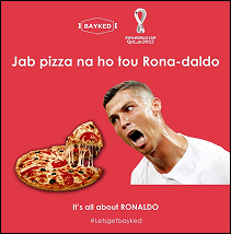
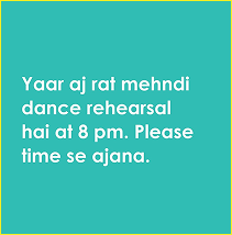
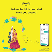
Most brands run the same content on every platform. We built two distinct systems. Instagram: bold color blocks, Urdu humor lines, food cravings ("Jab pizza na ho tou rona-daldo"). LinkedIn: clean line-art content with food-industry facts most people don't know.
Each platform got content built for its actual audience, not a copy-paste of the same post.
Launched the brand with a series of hunger-creating reels timed to Ramadan. Reasoning: people fasting all day are most susceptible to food cravings. Plant Bayked in their subconscious during the day, and they act on it after iftar.
Timing was the strategy. The creative did the execution.
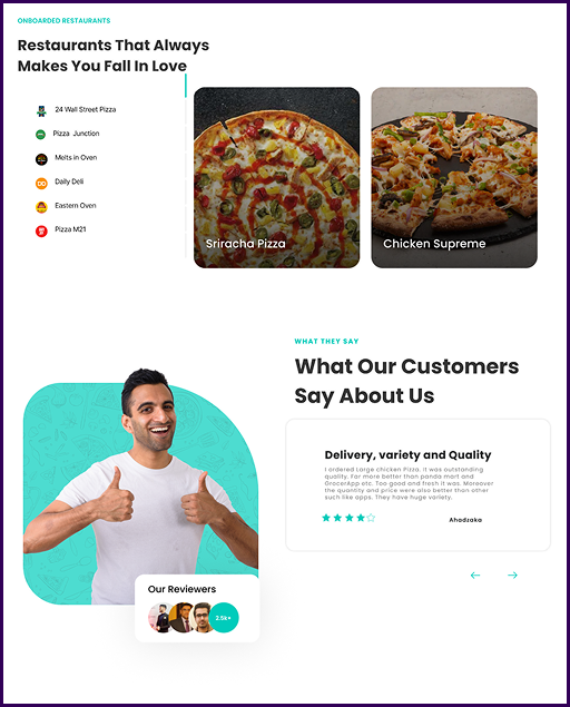
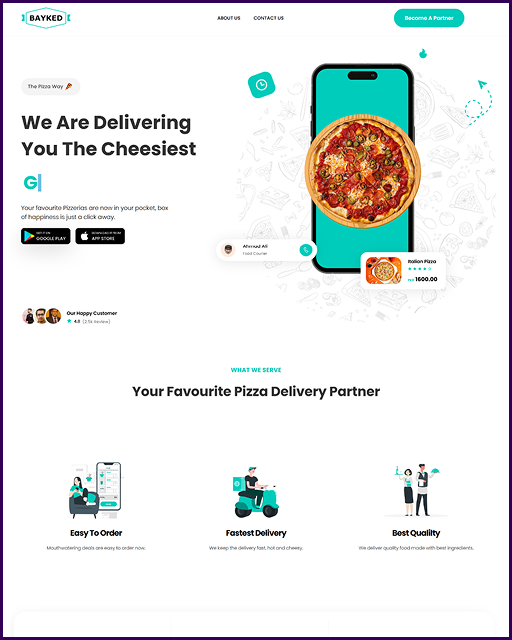
Designed the full landing page following conversion-led structure: hero with download CTA, "what we serve" benefits, restaurant onboarding proof, customer reviews, and final download push. Every section moved the visitor closer to the App Store.
Story-driven, not feature-listed. By the end, downloading felt obvious.
"A marketplace for restaurants. Built as the restaurant's brand extension, not another commission squeeze."
Most delivery apps lean on photography. We added a mascot so Bayked had a personality customers could spot in two scrolls. Recognition came from a face, not a typeface.
Instagram got bold blocks and Urdu humor for cravings. LinkedIn got clean line-art and food-industry facts. Built for the actual reader on each platform, not the same content recycled twice.
Timed hunger-creating reels for when fasting customers were most susceptible to food cravings. The brand landed in their subconscious during the day, and they ordered after iftar.
Bayked landed with a full brand world rather than a logo and a wish. The guideline doc was thorough enough that the team could keep producing content without the brand fragmenting.
By launch, the platform had 2,670+ app users, 120+ restaurants onboarded, and 1,550+ menu items live. The brand was working on every surface customers touched: app store, in-app, social, LinkedIn, and the landing page.
The bigger result was structural. One designer, one system, one consistent brand from cover to checkout.
Brand identity, brand guidelines, social systems, launch campaigns, and conversion-led landing pages. End-to-end, one consistent system.
Book a Call