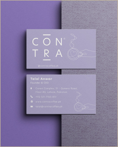
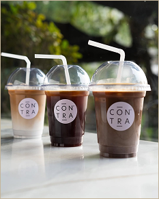
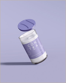
Full brand identity, visual system, and content strategy for a neighborhood café in Lahore. Built for the people who stay three hours, not the ones who post once and leave.
Lahore had no shortage of "aesthetic" coffee shops. They photographed well. They went viral once. Then customers moved on to the next one. Most cafés solved for the post, not the person who stays.
Contra was being built for a different customer. The freelancer working through the afternoon. The students with their laptops open at 9pm. The friends who meet for one coffee and end up staying three hours. People who needed somewhere to be.
Five connected moves across brand, design, and strategy. Each one supported the others. The repeat-visit behavior we wanted came from all of them working together.
Framed Contra as a place to work, study, meet, and stay. Not a quick takeaway stop. The menu reinforced this: coffee with dessert, food worth ordering, refills worth the second hour.
Used offers to shape the kind of traffic we wanted. Weekday coffee-and-dessert focus to bring in the laptop crowd during slower hours.
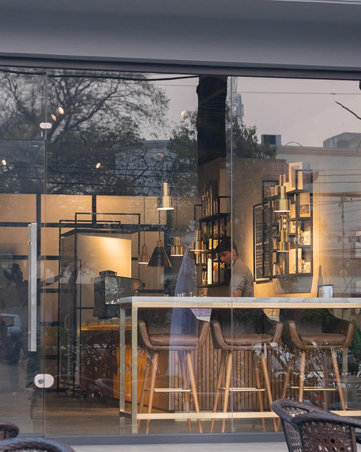
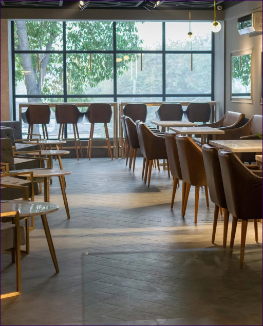
Shot the spaces to feel cosy and slightly elevated. Real light, real people. Kept colours warm and slightly muted so the space feels calm, not loud.
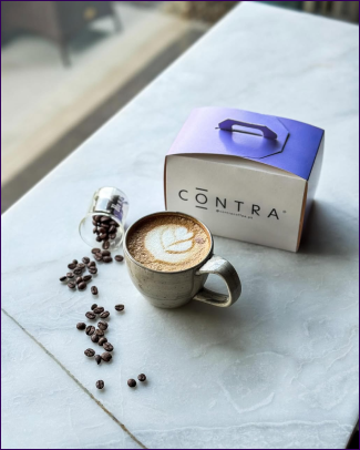
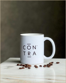
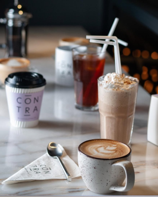
Made sure cups, plates, and small details read clearly in photos and video. These became mini brand cues that customers remembered.
Short, clear lines about meeting up, late nights, study sessions, dessert cravings. Used location and timing often: "Tonight in Gulberg," "This week at E7." So people knew exactly where and when.
Kept promo language simple. No fake hype. Just straight reasons to drop by.
Four pillars: people in the space (energy and mood), coffee and desserts close up (craving), space shots inside and rooftop (mental projection), simple promo posts tied to days and times.
Reused the strongest clips and photos across organic posts and local Meta ads so the look stayed consistent everywhere.
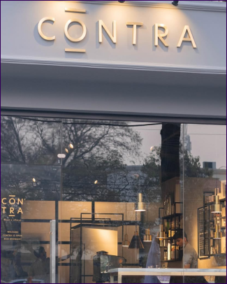
Aligned cups, interiors, signage, and the feed so the same colours and mood repeated everywhere. Built the system so the team could open new locations without rebuilding the brand from scratch.
From Gulberg to DHA to Islamabad, Contra still felt like Contra.
"We sell the concept and atmosphere. The cuisine follows. A basic style people can relate to and enjoy."
A single hue family, six tones. Calm enough to live with daily. Distinct enough to own a category most cafés avoid.


.png)


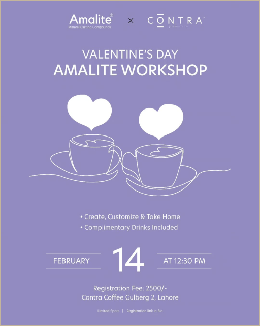
Contra moved from "another aesthetic café" to a recognizable neighborhood brand. The visual world stayed consistent across cups, interiors, signage, and feed. The one-line illustrations became Contra's calling card across every season.
Most importantly, the system held when the business scaled. From the original location to Gulberg, DHA, and Islamabad, every Contra still felt like Contra. The team didn't have to rebuild the brand for each new location.
The real result wasn't a viral moment. It was a brand built for the people who came back the next day, then the day after that. The freelancers, the students, the friends who stay three hours.
Brand identity, design systems, and content strategy for cafés, restaurants, and lifestyle brands that want repeat visits, not viral moments.
Book a Call