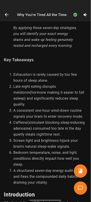
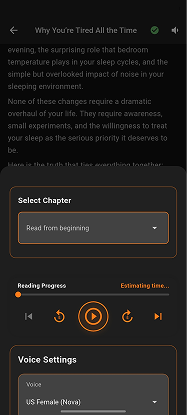
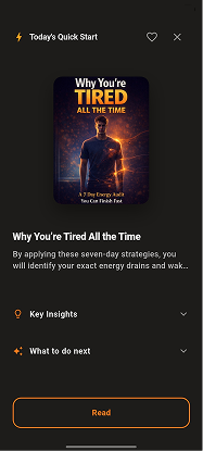
Full launch package for Growst, a mobile self-improvement app built for the audience who's tried everything. Customer research, brand strategy, identity, content system, app UI direction, paid ads, landing page. End-to-end.
Self-improvement is the most over-served category on the internet. Headspace, Calm, Atomic Habits, Huberman protocols, Whoop, Notion habit trackers. The audience Growst was built for has tried all of them. Most don't stick.
The problem isn't that people don't know what to do. They know exactly what to do. The problem is that every existing app, book, and podcast asks them to motivate themselves into a system, build a routine, and trust that consistency will pay off in three weeks.
Growst needed a launch that didn't ask the audience to be inspired. Or motivated. Or hopeful. It needed to ask them to do one specific thing tonight.
Five connected workstreams. The launch worked because the brand started with the audience research, not with the visual identity. Every workstream downstream was built against the persona findings.
Started with two months of audience research before any visual work began. Built two named, fully developed personas (Zara, 27, marketing manager, Instagram-first / Daniel, 34, product lead, LinkedIn-first). Each persona had day-in-the-life, what they'd tried, what they believed, what they feared, and exactly what would make them convert.
The personas became the operating manual for every workstream downstream. Every headline, every visual choice, every ad was tested against: would Zara save this, would Daniel comment on this?
The enemy wasn't Calm, Headspace, or Blinkist. The enemy was too much advice with no clear first step. The brand never named competitors. It named the audience's exhaustion with the category itself.
"Most apps do this. Growst doesn't" became a recurring frame. The contrarian position became the brand's whole proof of credibility.
Built a layered dark UI system (navy base, multiple surface depths, single warm orange accent) tuned for the evening user. Heavy Inter typography. Specificity over decoration. The brand's voice carries through every screen and every social post.
Three real Growst headlines that show the system at work: "170 toolkits. You pick one." / "One dot. Six waiting." / "3 actions · 8 min tonight." Every line is a specific behaviour at a specific time.
Instagram and LinkedIn don't get the same content. Zara converts on Instagram via emotional recognition and guilt removal. Daniel converts on LinkedIn via contrarian arguments backed by mechanism.
Same brand voice, two distinct funnel approaches. Built so the team can run both in parallel without diluting either.
App UI direction (75 screens, 91 navigation connections), landing page design, and ad creative all built against the same brand system. Navy base with the orange action accent from social to in-product.
The user who taps a Zara-targeted Instagram ad arrives on a landing page that feels like the same brand, then opens an app that continues the same world. No surface fights another.
Converts via: emotional recognition and guilt removal. Trigger: "save my Day 1 progress" framing. She's not buying information. She's buying the version of herself that actually follows through.
Converts via: credibility and structural framing. Trigger: "start my 14-day guided reset" framing. He converts when the trial feels like a commitment to a plan, not access to a library.
Calm, Headspace, Blinkist were the obvious enemies. We refused to position against them. The brand fights the behaviour ("too much advice, no clear first step"), not the category. This made Growst feel like the category's only honest brand.
Every existing self-improvement product required a future state to begin (Monday, the new year, the right mood). Growst's brand was built around one word that removed that barrier. "Tonight" appears in nearly every CTA, post, and ad headline.
Day 1 of any toolkit is free, with no card required. Giving away one complete, specific, real action converts better than any brand claim. The audience experiences the quality and wants the rest. Free value before the ask.
"Too much advice. No clear action. Get one step for today."
The brand refuses vague wellness language. Every claim is a specific behaviour, a specific number, a specific action. The audience is not being motivated. They're being shown what to do, exactly, tonight.
Growst launched into the most over-served category in consumer tech with a brand built against the category's conventions. The persona research became the operating manual that every workstream (visual identity, content, ads, app UI, landing page) was built against.
The brand system held across every surface. Instagram and LinkedIn ran different content streams to different audiences, with the same brand voice. The app, the landing page, and the ad creative all spoke the same language and used the same visual world.
Most importantly, the team launched with a system, not a logo. Every post, ad, and screen was built against the same audience model. The brand can keep shipping content without rebuilding the foundation each time.
Customer research, brand strategy, identity, content systems, paid ads, app UI direction, and landing pages. Built end-to-end against a real audience model.
Book a Call